Redesigning CK Notary: My Process Behind Transforming a Local Business Website
Oct 20, 2025 — by Himanshu Singh
Every good project begins with a simple question: "How can I make this better?" When I first looked at the CK Notary website, I saw a business providing real value to people — but their online presence didn't fully reflect their trust, clarity, or brand identity. So I took on a personal challenge: redesign the entire website from scratch, keeping the original business idea intact while modernizing everything else. To protect privacy, I changed all names, addresses, and numbers — but the creative and technical process remains fully my own.
1. Understanding the Purpose of the Redesign
CK Notary is a service-based business. That means the website must instantly communicate: Trust, Professionalism, Clarity, Ease of booking. The original site had all the information, but the layout, spacing, flow, and visual hierarchy made the experience feel outdated. My goal was simple: Create a modern, fast, high-conversion website that a small business would be proud to show any customer.
2. Planning the Structure & User Journey
Before writing any code, I mapped the entire site flow: Home, About, Services, Pricing, Contact / Booking. I wanted the user journey to feel natural: Understand what CK Notary does, Trust the brand with clean visuals, Explore services effortlessly, Take action with a clear call-to-action. This early planning helped guide every decision that followed.
3. Choosing the Right Tech Stack
I built the redesign using modern tools to ensure performance and scalability: Next.js 15 (App Router), React Server Components, Tailwind CSS for styling, shadcn/ui for clean, consistent components, Vercel for deployment. This stack ensured the website is: Fast, SEO-friendly, Easy to update, Pixel-perfect on all screens.
4. Rebuilding the Visual Identity
The redesign focused heavily on: Typography, Whitespace, Icons, Color palette, Responsive layout. I removed clutter and introduced: Soft shadows, Clean sections, Intuitive spacing, Strong headers, Meaningful micro-interactions. My goal was to make the website feel premium without feeling complicated.
5. Improving Service Presentation
The original service section lacked clarity, so I: Rewrote the descriptions, Added structured service cards, Highlighted pricing points, Created a clean layout for notarization services. This made the entire offering easier for first-time customers to understand.
6. Streamlining the Call-to-Action
Instead of hiding the booking button, I: Placed CTAs above the fold, Added sticky navigation, Added a clear "Book Now" button. This ensures users always know what to do next.
7. Building a More Trustworthy Brand Experience
A notary service needs trust. So I introduced: Professional color grading, Clean portraits (placeholder), A simplified about section, Testimonials layout, Clear footer information. Even subtle improvements dramatically improved credibility.
8. Deployment & Final Polish
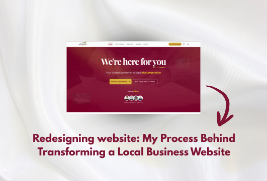
After completing the design: I deployed the site to Vercel, Ran SEO checks, Optimized images, Ensured Lighthouse scores for performance, accessibility, and best practices stayed high. Finally, I shared the before/after transformation — and the response was incredible. Original website: https://cknotary.com/ My redesigned version: https://cknotary-revamped-site.vercel.app/
Conclusion
This redesign helped me practice: Modern UI/UX, Responsive design, Real-world project thinking, Frontend development at scale, Product presentation. It also reminded me why I love building: Even a small local business deserves a beautiful digital presence. This project may have begun as a side quest, but it helped me sharpen my design intuition, refine my frontend skills, and push my creativity — and I'm proud of how it turned out.